



I know this is blatantly obvious for former Myspace users or others who are familiar with the site, but I wanted to share this with y'all. I never realized but I found this interesting comparison between 2010 Myspace and the current Friend Rewind. I was exploring the Wayback Machine and found this archived screenshot of Myspace from 2010 (note it's a little broken):
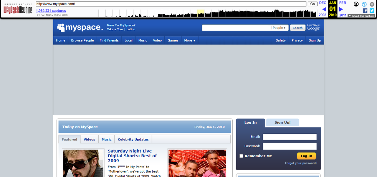
Now compare it to modern-day Friend Rewind:
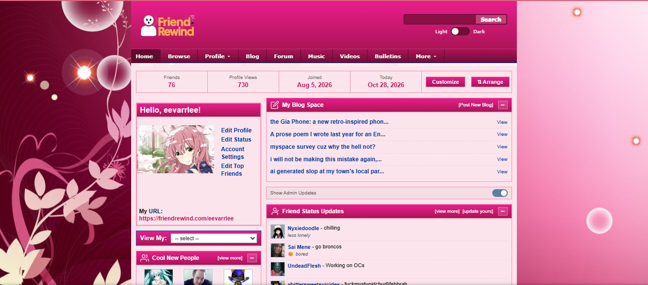
What do you notice?
One thing that immediately stood out to me was the navigation bar! The Friend Rewind taskbar has options like "Home," "Browse," and "Profile," which reminded me of the Myspace 2010 navigation bar, with options like "Home" and "Browse People."
It made me wonder whether Friend Rewind's layout takes inspiration from a later version of Myspace, instead of just recreating the site's earlier 2005–2008 look.
I think it's really interesting to compare the two and see how some of the same ideas from older social networks are still being used today!
Have any former Myspace users noticed other similarities between the two sites? I'd love to hear what you all think!
Comments
Displaying 0 of 0 comments ( View all | Add Comment )