


Doing this out of order because I want to. All of this is personal opinion.
1. Lucifer
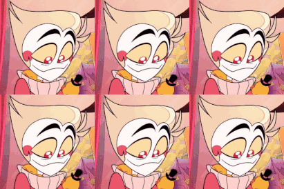
6/10, pretty good but not the best. I like how his hair resembles a duck/apple, along side that he has some pretty good shapes to work with, However I will say I think his full demon form is too complex and he looks too much like stolas in some shots.
2. Satan
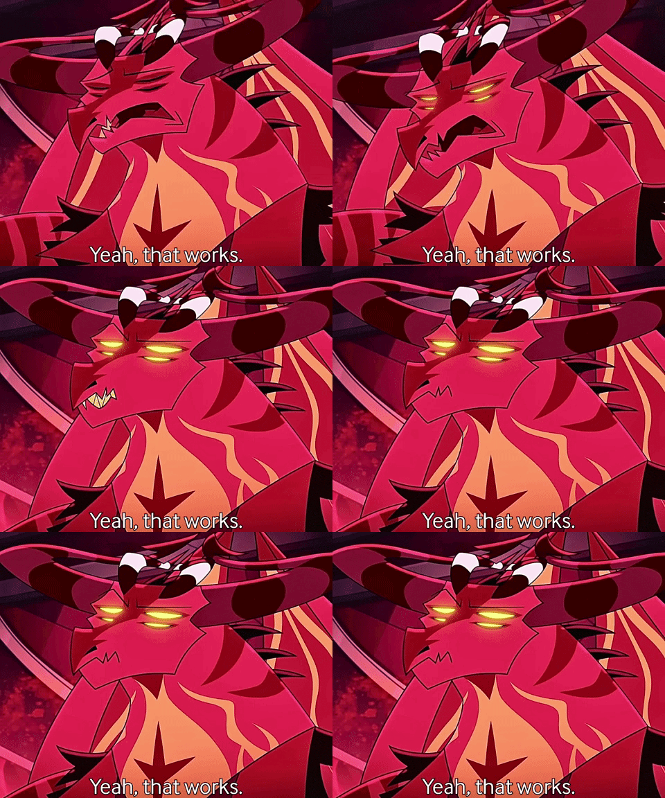
7/10 Not much to say. I think he’s memorable enough, big dragon with volcano patterns. He works well within the context of the show with imps being in his image and stuff
3. Ozzie
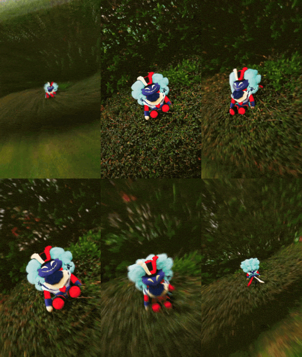
9/10, I actually quite like his design. I think it works well as a hyper stylized interpretation. He looks like a more modest burlesque dancer which while he could be more revealing I’d argue that his character believes lust is about the build up not the event. I can see the reasons people don’t like him though and that’s fair. I will say he was the first sin interpretation I saw so I’m a bit biased.
4. Bee
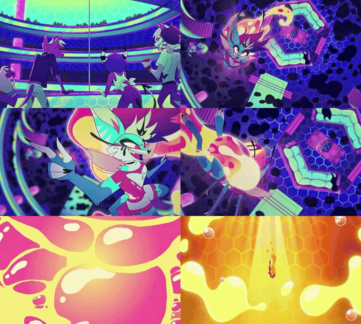
5/10, not my thing. I’m not a big fan of her design. While I understand it’s ment to be over complicated the elements don’t flow with the design well enough in my opinion. Some shots I like her, some shots I don’t. her conflicting clothes and hair bug me. I can see the vision though and I commend them for that. I also don’t like how the other sins get to be their own things and she looks so much like the hellhounds, however this a problem for a lot of the female sins, it’s just most prevalent in bee.
5. Leviathan
3/10, couldn’t even find a gif of them. There’s the same issue I have with bee, notice how the girls all have pupils and the men (except Lucifer) are allowed to have more monsterous eyes, I don’t mind this as much as Levi has both technically but still. She looks like a monster high doll. As for the other head it feels out of place, I would have been more ok with this if there were more mismatched design elements.just slap a crooked tail on the more humanoid one. I will say the concept is very interesting with one head being outwardly human and the other being more monstrous, I can see the design working better as we learn more about the character (this probably will not happen).
6. Mammon
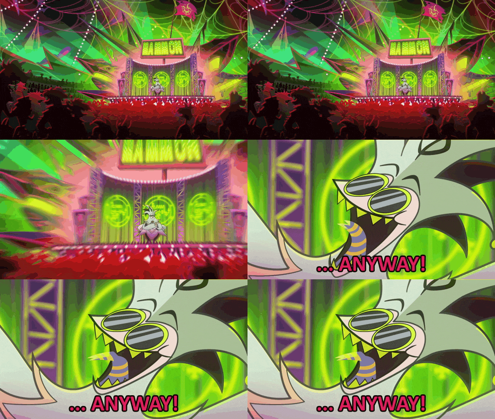
🪲/10
He’s green
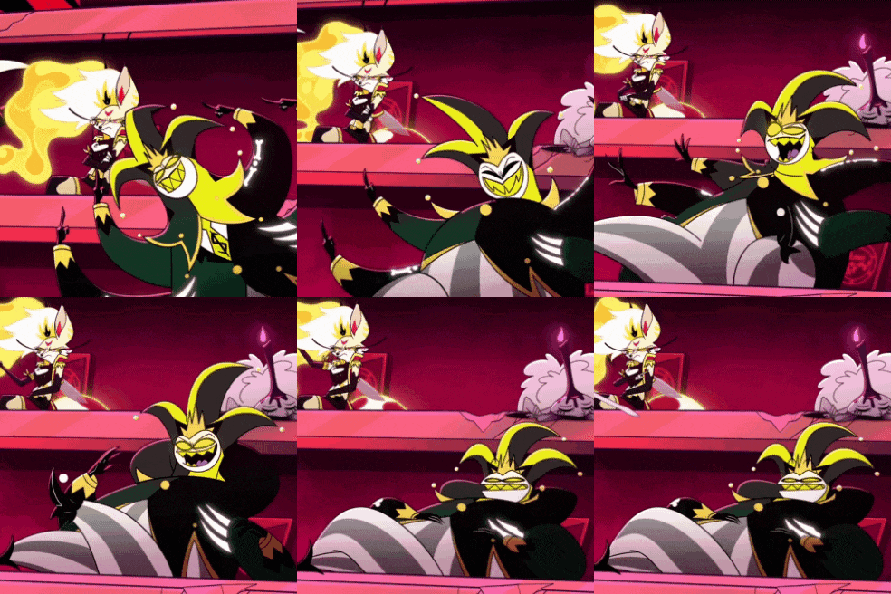
I wanna crack him open like a glowstick and suck out his colours till he’s nothing but pulp
Anyways -12 because he looks smelly, I mean this in a positive way.
7. Belphagor

?/10, She’s a sleepy sheep, how could I not like her? She looks like cute, I wish she was more fluffy because I want to hug the poor lass. Only reason I’m ranking her question mark is because it tics me off that her name sake was thrown out the window and she was confused with the demon known as Baphomet. I wish she had more trollish elements like her namesake, especially with all the cuter looking troll designs out there (just look at those little ones they sell in shops, adorable)
Anyways those were my thoughts, feel free to comment. I want your opinions
Comments
Displaying 2 of 2 comments ( View all | Add Comment )
Fren🌟Zi
(edited) Report
Im sorry you want to what and what till he’s nothing but what?
You heard me, Heathen. Don’t pretend like you’re any better.
by ReDeadSign; ; Report