I made my own banner for my blog and this is how you can too!

This was draft 1
this is draft 2 and then
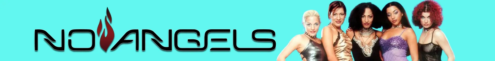
this is the current version!
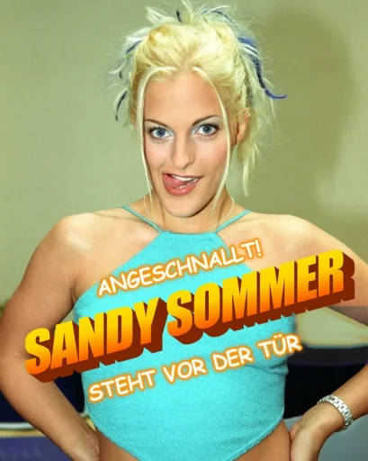
So as you can see I wanted to make my own banner for my blog with the logo and a picture of my favourite girl group at the moment, the No Angels. Don't worry, I haven't forgotten Monrose yet. The temperatures outside are for sure reminding me of the fact that it's "a, hot summer, a hot, hot summer"!
Now I did find a banner on fanart.tv, but it didn't fit the measurements. How to find them out? hit Fn and F12 on your keyboard at the same time and a Web development kit should open. Play around! I measured out the nav.top of the header and it read 800 x 100.
So I went to MS Paint, opened a canvas, extended it to 800 x 100, then headed to a image resizing tool online and fed in the logo, and then I cropped this absolutely gorgeous picture of the group in their first album lineup (Sandy, Vanessa, Jessica, Nadja and Lucy) : to around half the size so they're only visible from waist up, and fed that into the image resizer too. What's important is that I only changed the height to be 100, not the width as that can be adjusted in MS Paint. I then imported both into the canvas and figured out I should have coloured the canvas BEFORE importing the pictures... the recoloring wasn't ideal as you can see. It gives very much pixelated, unclean mess.
So I thought, hm, anyways I can decide the size in the css file on the layout, so how about keeping the resolution higher? So I deleted the 800 x 100 banner, made a new 1600 x 200 one, and this went much easier. All I now had to do to the original pictures was crop them in such a way the height is 200 px tall and I didn't have to feed it into the resizer, and then all I did was import the two pictures and play around a bit with the spacing. Obviously I coloured the canvas beforehand.
I realised the "NO" from the logo was too close to the Friend rewind logo, and that Jessica, Nadja and Lucy were covered by the search bar a little unfortunately, plus that the extra space after Lucy looked quite awkwrd, so after reshuffling the pictures in MS Paint by just selecting and dragging them to the side, and filling any gaps with the colour filler tool, I opened the Web Dev interface again and played around with the positioning and sizing of the logo and the search bar. I figured out that the search bar had a flex-justify attribute that could be changed to "end", which caused the search bar to jump down and not obscure the faces of the members, and that the friend rewind logo could be changed in size and in the padding. I changed the size to 35 px and the padding from 10 px to 5, and it fit with the size of the No Angels logo perfectly.
And now this is how my banner looks!
I know the white of the Friendrewind logo kinda clashes with the brightness of the turquoise, but let's see if I figure out something. Maybe I'll just recolour the banner with a darker turquoise? I'm not sure. But this is kinda the first time I did something like that and I think it's cool!
Comments
Displaying 3 of 3 comments ( View all | Add Comment )
Arcusthebest
IS THAT WEEZER IM SEEING RN?
Heyyyy! no, this is a girl group from Germany called the No Angels, they did europop and RnB/dance pop music! But everyone loves Buddy Holly by Weezer hehe. Fun fact, one of the members, Lucy Diakovska (the one on the right with the red curly hair) was in a musical called Buddy Holly when she started out in show business!
by seas_world; ; Report
I WASS JOKING TWINN, BUT STILL THANK U FOR TELLING ME THIS INFO!!
by Arcusthebest; ; Report