



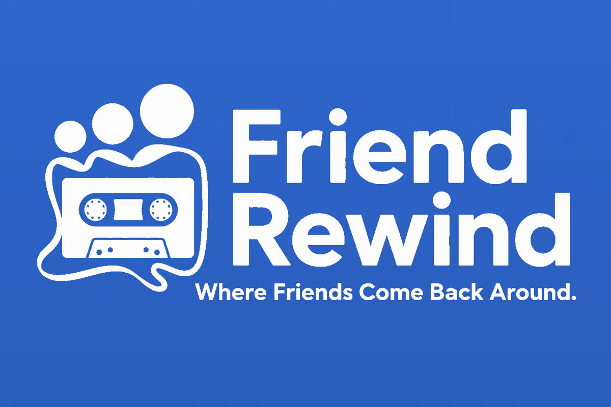
Been spending some time messing around with the profile lately — cleaning things up, bringing back a little old-school MySpace feel, and trying to make it feel a bit more like me. Now I'm on the fun part: coming up with a logo and a slogan. Something to pay tribute to the site and it's people. Here's a logo design I've come up with.
I wanted something that stood out, but still fits the whole vibe — a little nostalgic, a little pirate, a little retro-polished but definitely not something that looked too polished or corporate.
So now the question is:
- **What do yall' think?**
- **Does the slogan and design fit?**
Still brainstorming... 🎧💨🏴☠️
Am I onto something that clicks and sticks?.
***EDIT: I've replaced my profile logo to this. You can hotlink it yourself using the code below. Add < style > above and < / style > below it (No spaces.) Free free to share and pass around.
img[src*="friendrewind-logo.webp"] {
content: url("https://i.ibb.co/Q7LkDN1N/FWL.png") !important;
width: 180px !important;
height: auto !important;
object-fit: contain !important;
}
Comments
Displaying 0 of 0 comments ( View all | Add Comment )