

I've spent like a week or so on FriendRewind now on and off, and it's quickly became one of my favorite websites ever. It's fun, bustling, and very easy to use. I've been recommending my friends use it! That being said, I've noticed minor things that I feel like would be a huge quality of life update were it to be changed. I'm only a budding software engineer/web developer, so I don't view my thoughts as gospel. These aren't "fixes" so much as they're strong suggestions!
1. User Filtering
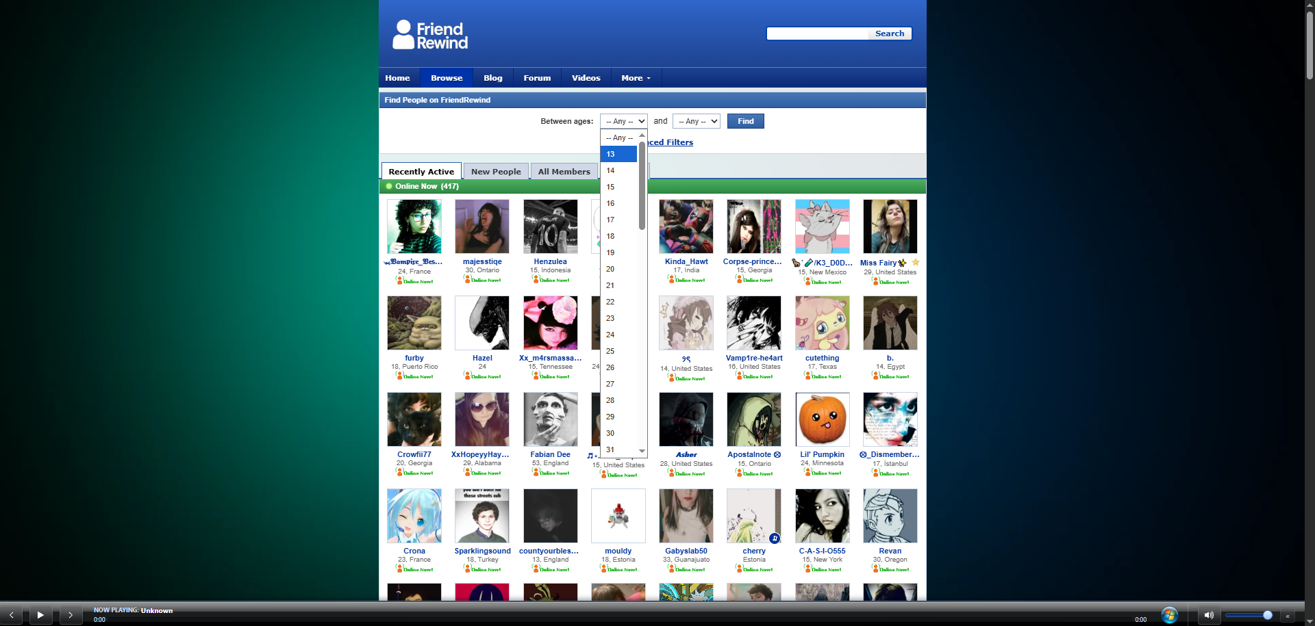
I know this site was made with Spacehey (SH) in mind and not just, MySpace, so I'm going to reference it a lot. I understand that on SH there was a persistent issue that half of the userbase was extremely young, and FriendRewind's (FR) solution to people wanting to talk to their age bracket was creating a filtering system, but this is extremely dangerous and irresponsible. I know that once you set your age to 18 once you log in, you can't filter below 18 anymore, but all it takes to bypass that is to log out, grab a url, and then log back in (as pictured above). On top of that, not displaying an age isn't an option either. Tools like this make it extremely easy for any bad actor to search for a kid in two clicks. The age issue is annoying, yes, but not revealing your age online is much more important. Grooming was a large issue already on SH, it would be horrible if that issue spread here with the added help any groomer would have. (I mean, some of my friends who are minors even call FR Pedo Craigslist.)
2. Inconsistency
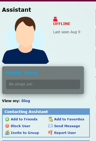
Half of the reason why the FR userbase uses the website is because they want to be immersed in the world of their "retro" 2000s aesthetic. On top of that, being "retro" is the selling point of the entire website. Despite that, many parts of the website look jarringly modern. I'm mainly put off by how out of place the music player looks on profiles--including default ones. The smooth and rounded gradient clashes with the MySpace aesthetic completely. Not to mention the music page looks like a completely different website from the other pages. (though I love the addition of it, don't remove it!) I noticed that this is really only an issue with additions to the website that were new/the idea of the site owner. If I had to guess, those pages are why the site gets vibecoding accusations. As cool as glowing borders and gradients look, I think taking some time to make the pages all look cohesive will go a long way at selling the immersion and only aid the website's selling point.
3. Redundancy and Unnecissarity
This was kind of fun practice for me first and foremost, but I do think what I mention is important. The navigation is redundant and affecting user retention. This one gets multiple pictures!
3a. The Menu Bar

My first thought: there's so many features, why the dead space??? One leg up that FR has on MS clones is that it has a lot of new features. That being said, they're kind of underutilized by the userbase. None of my mutuals even post bulletins, yet that was the main source of daily activity on SH. Actually, activity like bulletins, games, galleries, and groups are hidden. The last of which being a HUGE PROBLEM. Anyways though, the profile dropdown is nearly completely redundant. All of the options (status, settings, account editing, viewing your profile) are already on your homepage. Dropdowns are meant for multiple links to be easily and quickly accesible, but I checked and it takes the same amount of clicks to get from any other tab to your profile options using either the profile dropdown or home (It's two).
3b. Chatting
Secondly, the other reason why people use this website is to make friends. The groups feature should be more emphasized! A large issue on SH was that people were adding each other, but not talking to each other. Groups should be on the menu, not in a dropdown. Same with games & activities. Spacehey was a nice website, but what ultimately killed it was that people were logging in, making their profile, and leaving. That's because people need a reason to not just stay on your website, but come back, which sound similar but is ultimately different. Even if someone spends hours on the website, if they leave after a day it doesn't really matter in the end. But if they stay for just one hour every day, your site has integrated into their life.
What I'm trying to say here is that the way users chat with each other needs to be changed and prioritized. Right now it's a discord clone (sorry), but they're all nearly completely inactive. When people make friends on the website, they move to discord. Give them a reason to stay here instead. Impliment things discord doesn't do (chat background changing, background music, old school text boxes, custom stickers, for example).
Side note, there's 3 different ways to chat on the website and they're all seperate (games, DMs, and groups). Having them seperate is kind of janky, and people won't use messaging systems that are janky. People are very sensitive to ANY jank when it comes to messagine systems... god, I'm talking from experience with getting people to use mine LMAO. I had to refresh to see some messages sent to me, an unfortunate bug :(
3c. Show Your Shit Off!
The extra features added are creative, fun, and well implimented! Show them off! Put them on the menu bar!
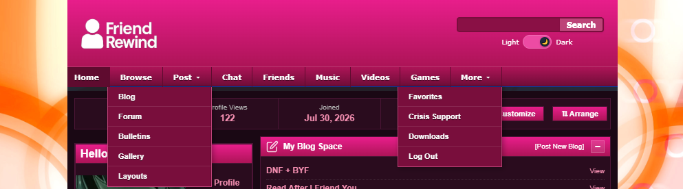
I made a mockup of what this might look like. I wanted all the different ways of posting to be in one place, rather than being seperated. It's more convenient and quick in my opinion. If you're wondering, the "Chat" tab is just groups. Also I feel like having the buttons fill the entire bar instead of being oriented to the left would look better, but I didn't feel like it. By the way, if you look closely you can see the Artists section is gone. I don't know why music artists is seperate from the music tab, but that feels kind of unnecessary. I think all things music should be together in its own hub for organization reasons.
I also added a "Friends" tab. For a website based on making friends, the activities your friends are up to should be more emphasized I feel! I love the friend activity notifications on my homepage, but I can't see a list of which of my friends are active, what groups they're in, if they're in the middle of a game/activity, what layouts they've posted or saved, a list of their forum posts, etc. If all that sounds intrusive I'd imagine there'd be toggles for what friends get to see or what only favorites can see. Things like that encourage interest on the site's other features.
Closing Thoughts
I apologize if I came off as harsh or overconfident in this. The only change I firmly stand on needing to be changed is the age filtering. That one is really dangerous. Like I said before these are only suggestions! I love the website very much and will continue to use it regularly, and I'm having a lot of fun ^_^ If you've read all my rambling, thank you!!
