
kaz/kazmir

"FLAMAINGOOO🦩"
OFFLINE
 OFFLINE
Last seen Aug 29
Mood: 😎
View my: Blog
Contacting kaz/kazmir
 Add to Friends

 Send Message
 Invite to Group
 Report User
FriendRewind URL:
https://friendrewind.com/profile.php?id=22434
kaz/kazmir's Interests
General |
|
Music |
|
Movies |
THUNDERBOLTS*
|
Television |
|
Books |
Comic Books ╰┈➤
|
Heroes |
|
Games |


kaz/kazmir's Photos [View All]
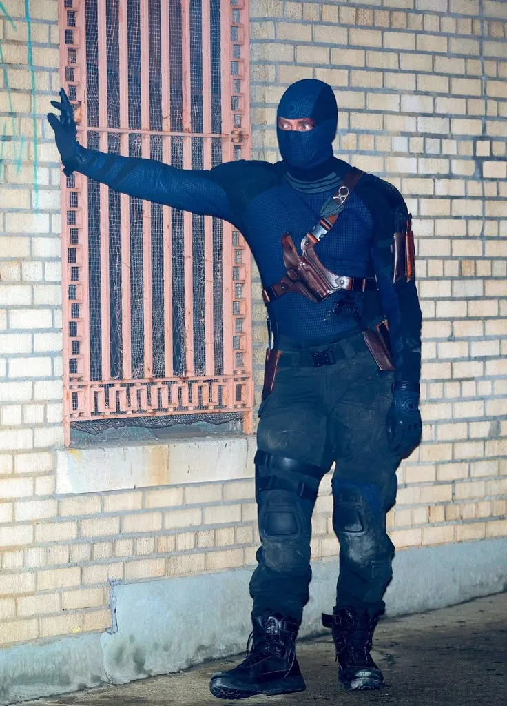
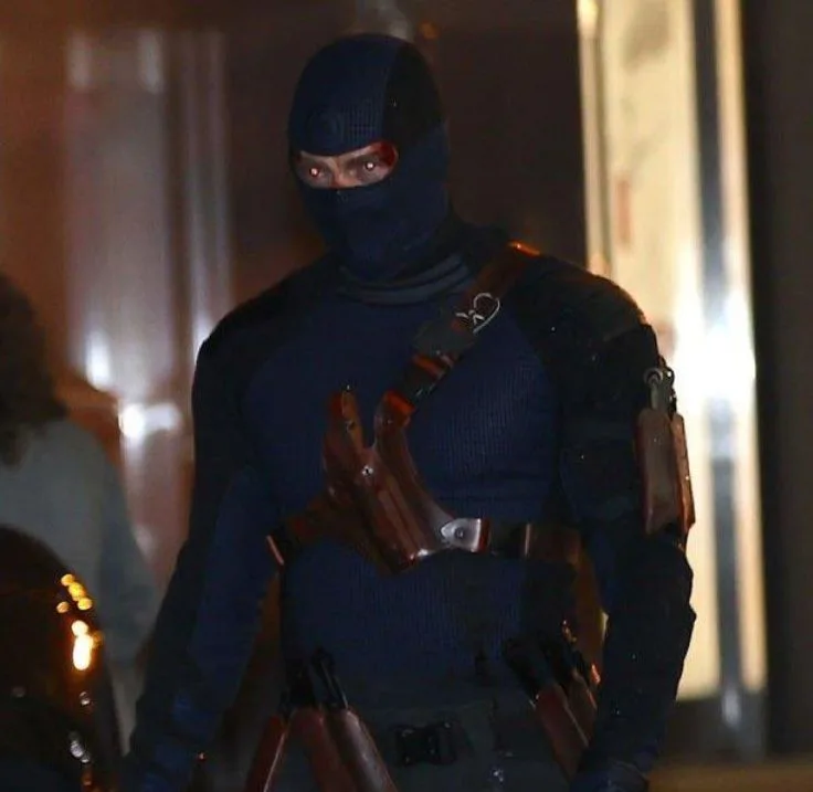
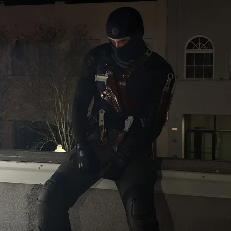
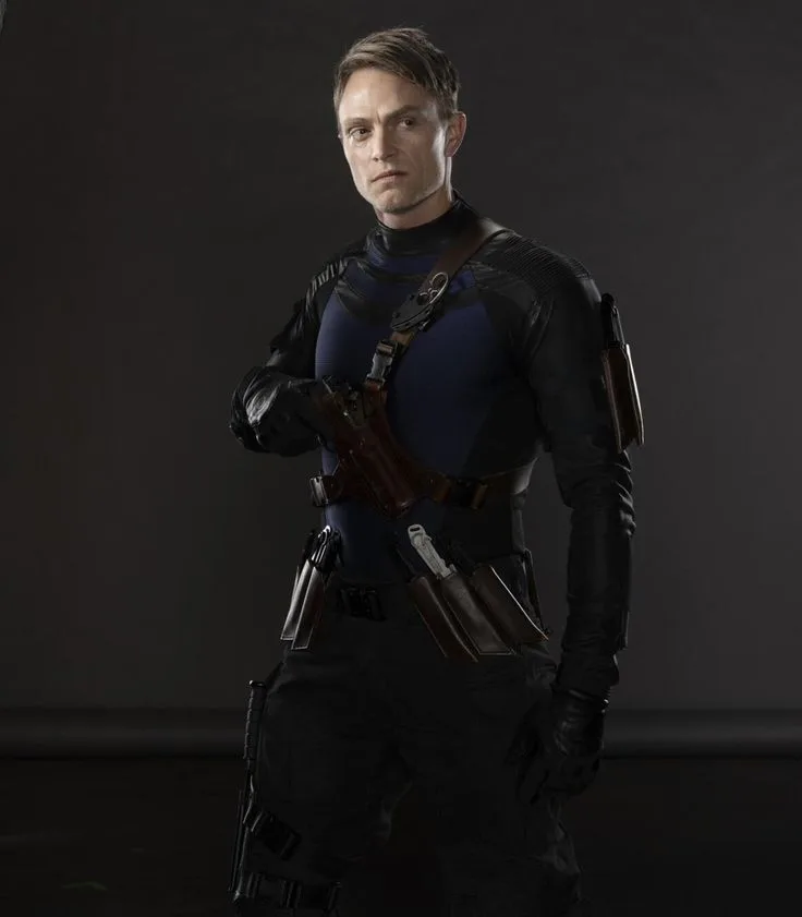
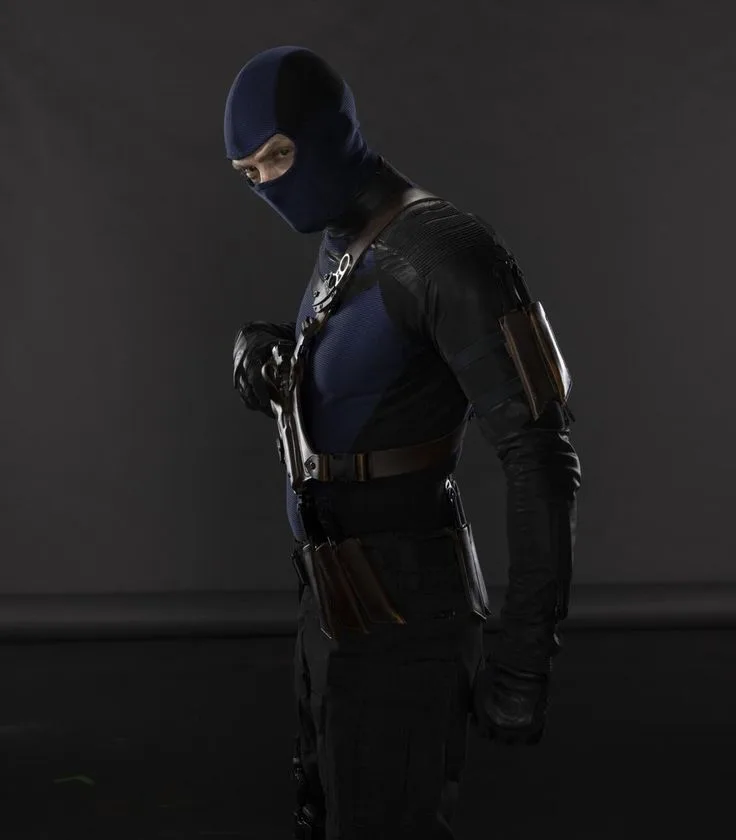
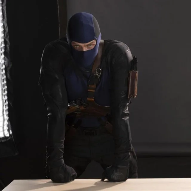






kaz/kazmir's Latest Blog Entries [View Blog]
There are no Blog Entries yet.
kaz/kazmir's Bio


<style>
/* Import a clean, friendly sans-serif font */
@import url('https://fonts.googleapis.com/css2?family=PT+Sans:wght@400;700&display=swap');
/* --- 1. THEME VARIABLES & KEYFRAMES -- */
:root {
--font-frutiger: 'PT Sans', 'Segoe UI', 'Helvetica', sans-serif;
/* Frutiger Aero Colors */
--fa-sky-blue: #00BFFF;
--fa-grass-green: #7CFC00;
--fa-white: #FFFFFF;
--fa-glass-bg: rgba(250, 250, 250, 0.4);
--text-dark: #2F4F4F;
}
@keyframes driftBokeh {
0% { transform: translateY(0) scale(1); opacity: 0.5; }
50% { opacity: 1; }
100% { transform: translateY(-100vh) scale(1.5); opacity: 0; }
}
@keyframes slideDroplet {
0% { transform: translateY(-50px) scaleY(1); opacity: 0; }
10% { opacity: 1; }
90% { opacity: 1; }
100% { transform: translateY(calc(100% + 50px)) scaleY(1.5); opacity: 0; }
}
@keyframes swirl {
0% { transform: translate(-100vw, -100vh) rotate(-60deg); opacity: 0; }
20%, 70% { opacity: 0.6; }
100% { transform: translate(100vw, 100vh) rotate(60deg); opacity: 0; }
}
@keyframes swirl2 {
0% { transform: translate(100vw, 100vh) rotate(45deg) scale(0.8); opacity: 0; }
20%, 70% { opacity: 0.4; }
100% { transform: translate(-100vw, -100vh) rotate(-45deg) scale(1.2); opacity: 0; }
}
/* UPDATED: Module entry animation with a subtle pop */
@keyframes fadeInSlideUp {
from {
opacity: 0;
transform: translateY(40px) scale(0.98);
}
to {
opacity: 1;
transform: translateY(0) scale(1);
}
}
@keyframes shimmer {
0% { transform: translateX(-100%); }
100% { transform: translateX(100%); }
}
@keyframes moveGradient {
0% { background-position: 0% 50%; }
50% { background-position: 100% 50%; }
100% { background-position: 0% 50%; }
}
@keyframes headerGlow {
0%, 100% { box-shadow: 0 8px 32px rgba(0, 0, 0, 0.3); }
50% { box-shadow: 0 8px 40px rgba(0, 191, 255, 0.4); }
}
/* NEW: Pulsing glow for contact icons */
@keyframes subtlePulse {
0%, 100% { transform: scale(1); }
50% { transform: scale(1.05); }
}
/* NEW: Ripple effect for search button */
@keyframes ripple {
to {
transform: scale(4);
opacity: 0;
}
}
/* --- 2. BASE STYLES & HYPER-LAYERED BACKGROUND --- */
body {
background-color: var(--fa-sky-blue) !important;
background-image: url('https://friendrewind.com/layouts/img/1349540.png') !important;
background-attachment: fixed !important;
background-size: cover !important;
background-position: center center !important;
font-family: var(--font-frutiger) !important;
font-size: 15px !important;
color: var(--text-dark) !important;
position: relative;
overflow-x: hidden !important;
}
/* Layer 2: Drifting Bokeh */
body::before {
content: '' !important;
position: fixed;
top: 0; left: 0;
width: 100%; height: 100%;
box-shadow:
10vw 90vh 80px 0px rgba(124, 252, 0, 0.3),
80vw 70vh 120px 0px rgba(0, 191, 255, 0.3),
50vw 10vh 90px 0px rgba(255, 255, 255, 0.4),
20vw 50vh 150px 0px rgba(0, 191, 255, 0.2);
animation: driftBokeh 30s linear infinite;
z-index: 1 !important;
pointer-events: none;
}
/* Layer 3: Vector Swirls */
body::after {
content: '' !important;
position: fixed !important;
top: 0; left: 0;
width: 200vw; height: 200vh;
background:
url('https://www.friendrewind.com/static/uploads/imageb/fa-swirl.png') no-repeat center center / contain,
url('https://www.friendrewind.com/static/uploads/imageb/fa-swirl.png') no-repeat center center / contain;
z-index: 2 !important;
pointer-events: none !important;
animation: swirl 15s ease-in-out infinite, swirl2 20s ease-in-out infinite;
animation-delay: -5s, -15s;
}
main, .container, .master-container { background: none !important; border: none !important; box-shadow: none !important; position: relative; z-index: 100; }
/* --- 4. THEMED MODULE CONTAINERS (AERO GLASS) --- */
.contact, .url-info, .table-section, .tunes, .blog-preview, .blurbs, .friends, #comments {
background: var(--fa-glass-bg) !important;
border: 1px solid rgba(255, 255, 255, 0.7) !important;
border-top-color: rgba(255, 255, 255, 0.9);
border-left-color: rgba(255, 255, 255, 0.9);
border-radius: 12px !important;
margin-bottom: 30px !important;
padding: 0 !important;
position: relative !important;
backdrop-filter: blur(12px) saturate(120%) !important;
box-shadow: 0 8px 32px 0 rgba(0, 0, 0, 0.2), inset 0 1px 0 0 rgba(255, 255, 255, 0.5) !important;
transition: all 0.4s cubic-bezier(0.25, 0.8, 0.25, 1);
opacity: 0;
animation: fadeInSlideUp 0.8s cubic-bezier(0.25, 0.8, 0.25, 1) forwards;
}
.contact:hover, .url-info:hover, .table-section:hover, .tunes:hover, .blog-preview:hover, .blurbs:hover, .friends:hover, #comments:hover {
transform: translateY(-8px) scale(1.01);
box-shadow: 0 16px 40px 0 rgba(0, 0, 0, 0.3), inset 0 1px 0 0 rgba(255, 255, 255, 0.5) !important;
}
.url-info { animation-delay: 0.1s; }
.friends { animation-delay: 0.2s; }
.blurbs { animation-delay: 0.3s; }
.tunes { animation-delay: 0.4s; }
#comments { animation-delay: 0.5s; }
/* The "Overkill" Water Droplet Effect */
.contact::before, .url-info::before, .table-section::before, .tunes::before,
.blog-preview::before, .blurbs::before, .friends::before, #comments::before {
content: '' !important;
position: absolute !important;
top: 0; left: 30%;
width: 6px !important; height: 20px !important;
background: linear-gradient(to bottom, rgba(255,255,255,0.7), rgba(255,255,255,0.3));
border-radius: 50% / 30% 30% 70% 70%;
z-index: 5 !important;
animation: slideDroplet 12s cubic-bezier(0.6, -0.28, 0.735, 0.045) infinite;
animation-delay: -3s;
}
/* --- 6. THEMED HEADERS (GLOSSY) --- */
.contact .heading, .url-info .heading, .table-section .heading, .tunes .heading,
.blog-preview h4, .blurbs .heading, .friends .heading, #comments .heading {
color: var(--text-dark) !important;
font-weight: 700 !important;
font-size: 18px !important;
text-shadow: 0 1px 1px rgba(255, 255, 255, 0.8) !important;
padding: 10px 15px !important;
margin: 0 !important;
border-bottom: 1px solid rgba(255, 255, 255, 0.7) !important;
background: rgba(0,0,0,0.05) !important;
position: relative;
overflow: hidden; /* Important for the shimmer effect */
}
/* Shimmer effect on headers */
.contact .heading::after, .url-info .heading::after, .table-section .heading::after, .tunes .heading::after,
.blog-preview h4::after, .blurbs .heading::after, .friends .heading::after, #comments .heading::after {
content: ''; position: absolute; top: 0;
transform: translateX(-100%);
width: 100%; height: 100%;
background: linear-gradient(90deg, transparent, rgba(255,255,255,0.4), transparent);
animation: shimmer 5s infinite;
animation-delay: 2s;
}
/* --- 7. CONTENT & LINKS --- */
.contact .inner, .url-info p, .table-section .inner, .tunes .inner,
.blog-preview, .blurbs .inner, .friends .inner, #comments .inner {
padding: 20px !important;
line-height: 1.7;
}
a {
color: #005A9C !important;
text-decoration: none !important;
font-weight: bold;
position: relative; /* Needed for the new underline effect */
transition: all 0.3s ease !important;
}
/* Animated underline effect */
a:not(.main-nav a)::after {
content: '';
position: absolute;
width: 100%;
transform: scaleX(0);
height: 2px;
bottom: -4px;
left: 0;
background: linear-gradient(to right, var(--fa-grass-green), var(--fa-sky-blue));
transform-origin: bottom right;
transition: transform 0.3s cubic-bezier(0.25, 0.8, 0.25, 1);
}
a:hover:not(.main-nav a)::after {
transform: scaleX(1);
transform-origin: bottom left;
}
a:hover { color: var(--fa-sky-blue) !important; text-shadow: 0 0 5px rgba(0, 191, 255, 0.5); }
/* NEW: Pulsing animation for contact icons */
.contact .inner a {
display: inline-block; /* Needed for transform to work */
animation: subtlePulse 4s infinite ease-in-out;
}
.contact .inner a:nth-of-type(2) { animation-delay: 0.3s; }
.contact .inner a:nth-of-type(3) { animation-delay: 0.6s; }
.contact .inner a:hover { animation-play-state: paused; }
/* --- 8. FRIENDS & PHOTO GALLERY STYLING (AQUA BUBBLES) --- */
.friends-grid img, .table-section .inner img {
border-radius: 18px !important; padding: 5px !important;
background: linear-gradient(135deg, rgba(0,191,255,0.5) 0%, rgba(124,252,0,0.5) 100%);
border: 1px solid rgba(255,255,255,0.8) !important;
box-shadow: 0 4px 10px rgba(0,0,0,0.2), inset 0 2px 2px rgba(255,255,255,0.7) !important;
transition: all 0.3s ease; box-sizing: border-box !important;
background-size: 200% 200% !important;
animation: moveGradient 8s ease infinite;
}
.friends-grid img:hover, .table-section .inner img:hover {
transform: scale(1.1) !important;
animation-play-state: paused;
box-shadow: 0 8px 20px rgba(0,0,0,0.3), inset 0 2px 2px rgba(255,255,255,0.7), 0 0 15px var(--fa-sky-blue) !important;
}
.friends-grid img { max-width: 80px !important; }
/* --- 8b. MAIN PROFILE PHOTO STYLING --- */
.profile-pic img, .user-image img, .general-about .details-below .pic-container img {
border-radius: 18px !important; padding: 5px !important;
background: linear-gradient(135deg, rgba(0,191,255,0.5) 0%, rgba(124,252,0,0.5) 100%) !important;
border: 1px solid rgba(255,255,255,0.8) !important;
box-shadow: 0 4px 10px rgba(0,0,0,0.2), inset 0 2px 2px rgba(255,255,255,0.7) !important;
transition: all 0.3s ease !important; box-sizing: border-box !important;
background-size: 200% 200% !important;
animation: moveGradient 10s ease infinite reverse;
}
.profile-pic img:hover, .user-image img:hover, .general-about .details-below .pic-container img:hover { transform: scale(1.05) !important; }
/* --- 9. THEMED TABLES --- */
.details-table { border: 1px solid rgba(255,255,255,0.8); border-radius: 8px; overflow: hidden; box-shadow: 0 2px 5px rgba(0,0,0,0.1); }
.details-table th { background: linear-gradient(to bottom, #fefefe, #e0e0e0) !important; color: var(--text-dark) !important; text-shadow: 0 1px 0 white !important; }
.details-table tr { transition: background-color 0.3s ease; }
.details-table tr:nth-child(even) td { background-color: rgba(255,255,255,0.3) !important; }
.details-table tr:hover td { background-color: rgba(0, 191, 255, 0.2) !important; transform: scale(1.01); }
/* --- 10. SCROLLBARS (GLOSSY AERO) --- */
::-webkit-scrollbar { width: 14px !important; }
::-webkit-scrollbar-track { background: rgba(0, 191, 255, 0.1); border-radius: 10px; }
::-webkit-scrollbar-thumb {
background: linear-gradient(to right, #7CFC00, #00BFFF) !important;
border-radius: 10px;
border: 2px solid rgba(255,255,255,0.8);
background-size: 200% 100% !important;
animation: moveGradient 4s linear infinite; /* NEW: Animated scrollbar thumb */
}
/* --- 11. HEADER & NAVIGATION (FINAL, FUNCTIONAL DESIGN) --- */
.main-header, .myspace-header {
background-image: linear-gradient(to bottom, rgba(255, 255, 255, 0.7) 0%, rgba(255, 255, 255, 0.3) 10%, transparent 100%),
linear-gradient(to bottom, rgba(0, 150, 220, 0.8) 0%, rgba(0, 191, 255, 0.7) 100%) !important;
background-size: 100% 100% !important;
border: 1px solid rgba(255, 255, 255, 0.5) !important;
border-radius: 12px !important;
margin: 20px auto !important;
padding: 10px !important;
box-shadow: 0 8px 32px rgba(0, 0, 0, 0.3) !important;
backdrop-filter: blur(8px) !important;
transition: all 0.3s ease;
animation: headerGlow 6s ease-in-out infinite;
}
.top-nav, .main-nav-wrapper { background: transparent !important; border: none !important; box-shadow: none !important; }
.top-nav {
display: flex !important; justify-content: space-between !important; align-items: center !important;
padding-bottom: 8px !important; border-bottom: 1px solid rgba(255, 255, 255, 0.3) !important;
}
.main-nav-wrapper {
display: flex !important; justify-content: center !important; align-items: center !important;
flex-wrap: wrap !important; padding-top: 5px !important;
}
.main-nav a, .nav a {
color: white !important;
text-shadow: 0 1px 2px rgba(0, 0, 0, 0.4) !important;
font-size: 15px !important; font-weight: bold !important;
background: none !important;
padding: 6px 10px !important; margin: 2px !important;
border: 1px solid transparent !important; border-radius: 7px !important;
transition: all 0.2s ease-in-out !important;
}
.main-nav a:hover, .nav a:hover {
transform: translateY(-2px);
background: rgba(255, 255, 255, 0.2) !important;
border-color: rgba(255, 255, 255, 0.4) !important;
}
/* Clean search box styling */
.top-nav .search-box input[type="text"] {
background: #FFFFFF !important; border: 1px solid #B0D1E0 !important;
border-radius: 6px !important; color: #000 !important;
padding: 6px 9px !important; box-shadow: inset 0 1px 3px rgba(0,0,0,0.15) !important;
transition: all 0.3s ease;
}
.top-nav .search-box input[type="text"]:focus {
border-color: var(--fa-sky-blue);
box-shadow: inset 0 1px 3px rgba(0,0,0,0.15), 0 0 8px rgba(0, 191, 255, 0.5);
}
.top-nav .search-box input[type="submit"] {
font-family: var(--font-frutiger) !important; border-radius: 6px !important;
border: 1px solid #75ADC5 !important; color: var(--text-dark) !important;
font-weight: bold !important;
background: linear-gradient(to bottom, #FFFFFF 0%, #E8F4F8 100%) !important;
padding: 6px 12px !important; text-shadow: 0 1px 0 rgba(255,255,255,0.5) !important;
position: relative; overflow: hidden;
}
/* NEW: Ripple animation on search button */
.top-nav .search-box input[type="submit"]:active::after {
content: "";
position: absolute;
border-radius: 50%;
background-color: rgba(255,255,255,0.8);
width: 100px; height: 100px;
margin-top: -50px; margin-left: -50px;
animation: ripple 0.5s ease-out;
}
</style>
kaz/kazmir's Friend Space
[view all]kaz/kazmir has 1 friends.

Displaying 0 of 0 comments ( View all )